Two posts a day, what a good reboot! But now back to topic – and just to make sure you’ve got your expectations right: I’m not talking about Incarna and this isn’t something about some awesome super special establishment serving alcohol, boosters and other stuff. It’s about the NeoCom bar you might love or hate, depending on your play style – or more specific, it’s future incarnation (oh, look, still some “Incarna”!).
 After some rumors about renamed missiles (to bring their names more in line) I patched my SiSi installation just to find the names unchanged (or I looked at the wrong names). But I found something different the second I logged in. The NeoCom bar (the button bar on the left corner of the screen you might know under a different name) changed.
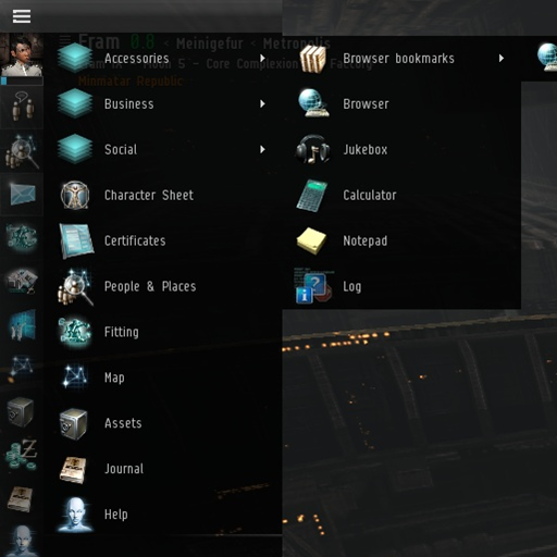
What appears to be a simple cosmetic change is in fact a lot more than I expected at first. The buttons got an updated look, yes, but there’s also a lot more hidden functionality behind them. If you’re running Windows 7 or you’ve used it in the past, you’ll feel right at home. It’s almost everything there. I just couldn’t find pinning yet, but there’s a neat replacement for that. Anyway, let’s start: Here’s a short overview.
- If you open a new window, the window will minimize to its associated button. If there’s no button (e.g. the for the web browser), then a new button appears on the bottom.
- Buttons for undocking, Items and Ships (inside stations) will appear on the bottom left of the screen (just above the calendar).
- You’re able to drag & drop icons to sort them the way you’d like to.
- It’s possible to remove almost any button by right clicking it and accessing its associated context menu. Once it’s gone, you’re able to add it again dragging the entry from the EVE Menu (see below).
- There’s a new button for the chat channels on the top, allowing you to navigate to the channels you’ve opened.
- Right below your avatar image is a small bar showing you your current skill training progress (relative to the skill points required for next level). Clicking on it opens your skill queue.
- The topmost button (above your avatar image) is the new “EVE Menu” hosting all possible options, from basic links pointing to the character window, over the certificate planer to all kind of ship and help related stuff you might have seen before in the NeoCom bar. This works a lot like Windows’ Start Menu. Similar to the Start Menu there’s also a sub folder containing all your web browser bookmarks.

- To allow more organisation, it’s possible to add new button groups to the bar using its context menu. That way you can create your own groups, if you’re lacking screen space or you simply love organizing stuff into folders, categories and the like. How about creating a “Missioning” or “Production” button having all the links to your favorite sites for that particular topic? Update: It seems like you can’t drag and drop browser bookmarks yet. Hope they’ll add that soon!
- Even more? I’m not sure. Tell me, if you’ve found something I didn’t mention already. I’m curious to see what other things they added without telling us in advance (or did I miss something?)!
I don’t know when these changes go live, but I’m really looking forward to see them on Tranquility, too. Finally I’m able to remove all those buttons I never use anyway, while granting the more often used buttons a more prominent position. This is going to be awesome.
Also, just to mention it. There are some more UI changes, like obviously some new “compact mode” for the user list in chat windows. Dsan got a screenshot on his blog, but I couldn’t get it working or reproduce it. Although, to be honest, I was far too excited toying around with the new button bar, to look for such a new option.
Update: After looking through the official forum, I noticed a discussion thread with a short introduction to the new Ui stuff (well, it’s mentioned). Although there aren’t any immediate screenshots, there are some developer responses to concerns and thoughts. I suggest you participate there, if you’re unhappy with some particular design decision or anything else regarding the new bar.
Update 2: There’s an official Dev Blog out now.
Labels: Generic


 After some rumors about renamed missiles (to bring their names more in line) I patched my SiSi installation just to find the names unchanged (or I looked at the wrong names). But I found something different the second I logged in. The NeoCom bar (the button bar on the left corner of the screen you might know under a different name) changed.
